


Hello Elephants! Understanding forex charts is essential for making informed trading decisions in the currency markets. In this article, we will break down the key components of reading forex charts, focusing on making it clear and accessible whether you’re new to trading or looking to sharpen your skills.
Introduction to Forex Charts
What is a Forex Chart?
A forex chart is a graphical representation of how currency pairs move in value over a specific time period. It’s a visual tool that shows you the price movements of one currency relative to another (e.g., EUR/USD) across various timeframes, from minutes to days or even months.
At its core, a forex chart allows you to see historical data and trends, helping you spot potential trading opportunities. If you want to know whether the euro is gaining or losing value against the dollar, a forex chart gives you that information in an easy-to-understand format. It is the foundation for both technical analysis and market decision-making, which are crucial for successful trading.
Types of Forex Charts
There are three primary types of forex charts that traders use: line charts, bar charts, and candlestick charts. Each type has its strengths, and different traders may prefer one over the others depending on their trading style.
1. Line Charts
A line chart is the most basic type of forex chart. It simply connects the closing prices of a currency pair over a certain period of time with a line. This chart type gives a clear, straightforward picture of the overall price trend. However, because it only shows closing prices, it lacks detail about price fluctuations within the period.
- When to use a line chart: When you want a quick overview of the market’s direction without getting into the detailed ups and downs of each trading session.

2. Bar Charts
A bar chart provides more information than a line chart. It not only shows the closing price but also the opening price, the highest price, and the lowest price during the selected timeframe. Each “bar” on the chart represents a specific period, such as an hour, day, or week, and the vertical line shows the price range for that period.
- Reading a bar chart:
- The top of the vertical bar shows the highest price reached during the timeframe.
- The bottom of the bar shows the lowest price.
- A short horizontal line on the left indicates the opening price.
- A short horizontal line on the right indicates the closing price.
- When to use a bar chart: When you want more insight into the price movements within a certain timeframe, including volatility and the range between highs and lows.
3. Candlestick Charts
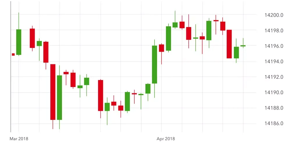
The candlestick chart is by far the most popular and widely used chart type among forex traders. Like a bar chart, it shows the open, high, low, and close prices, but it presents this information in a more visually engaging way. Each “candlestick” has a body that shows the range between the opening and closing prices, and wicks (or shadows) that indicate the highs and lows within the timeframe.
- Candlestick colour: Typically, green (or white) candles indicate a price increase (bullish movement), while red (or black) candles indicate a price decrease (bearish movement).
- Why traders love candlestick charts: Candlestick charts are valued for their ability to highlight trends, reversals, and patterns. The visual clarity makes it easier to spot important market signals at a glance.
Which Chart Should You Use?
Each chart type serves a different purpose, and many traders use a combination of them depending on their analysis goals:
- Line charts are perfect for identifying general trends.
- Bar charts give more detail about price ranges and volatility.
- Candlestick charts are excellent for spotting patterns and reading market sentiment.
Most forex platforms allow you to switch between chart types easily, so you can experiment and find which one works best for your trading style.
Key Components of a Forex Chart
Now that we’ve covered the basics of forex charts and their different types, it’s time to dig deeper into the key components that make up these charts. Understanding these elements will allow you to interpret price movements with greater clarity and precision. In this chapter, we’ll look at currency pairs, timeframes, price scales, and volume indicators—the essential building blocks of any forex chart.
Currency Pairs
Forex trading involves the buying and selling of currency pairs. Each pair consists of two currencies: the base currency and the quote currency. For example, in the pair EUR/USD:
- EUR (Euro) is the base currency.
- USD (US Dollar) is the quote currency.
The price shown on the chart tells you how much of the quote currency (USD) is required to buy one unit of the base currency (EUR). If the price of EUR/USD is 1.2000, it means 1 Euro costs 1.20 US Dollars.
Why is this important?
When you’re looking at a forex chart, the price movements represent changes in the value of the base currency relative to the quote currency. If the price goes up, it means the base currency is strengthening against the quote currency. If the price goes down, the base currency is weakening.
Timeframes
Forex charts are organised by timeframes, which determine how much data is included in each point, bar, or candlestick on the chart. Timeframes can range from as short as one minute to as long as one month, depending on the level of detail you want to analyse.
- Short-term timeframes (1 minute, 5 minutes, 15 minutes): Useful for day traders and those looking to catch quick price movements. However, they can be more volatile and show a lot of “noise.”
- Medium-term timeframes (1 hour, 4 hours): Ideal for swing traders who hold positions for several days or weeks.
- Long-term timeframes (1 day, 1 week, 1 month): More suited for long-term investors interested in overall trends rather than short-term fluctuations.
Most trading platforms allow you to switch between timeframes easily, giving you flexibility in how you view price data. Many traders use multiple timeframes to get a broader understanding of the market. For example, you might look at a 1-hour chart to see immediate price action and then check a daily chart for a broader trend.
Price Scale
The price scale on the vertical (y-axis) of the chart displays the value of the currency pair at any given moment. As you move your cursor across the chart, you can see the exact price of the currency at specific points in time.
Forex prices are typically displayed with four to five decimal places. For example, EUR/USD might be priced at 1.2056. In most pairs, each price change at the fourth decimal place is known as a pip, which is the smallest unit of measurement in forex trading. However, for some pairs (like USD/JPY), the second decimal place is used.
Volume Indicators
Although forex is a decentralised market, most platforms offer volume indicators, which estimate the number of transactions taking place within a given timeframe. These indicators don’t show the exact volume but can give you a good sense of market activity.
- High volume often indicates strong interest in the currency pair, which can lead to larger price movements.
- Low volume suggests weaker interest and is often associated with slower price changes.
Volume indicators can be useful for confirming trends. For instance, if a price is moving up while volume is also increasing, this is often seen as a strong signal that the trend may continue. Conversely, if volume is decreasing as the price rises, it may indicate a weakening trend.
Reading Candlestick Charts
Candlestick charts are one of the most popular tools for forex traders, providing a wealth of information in a visually clear format. Now that you’re familiar with the core components of a forex chart, let’s explore how to read and interpret candlestick charts, focusing on their anatomy and how you can use them to identify potential market trends.
Basic Anatomy of a Candlestick
Each candlestick on a chart represents price movement within a specific timeframe, whether it’s one minute, one hour, or one day. Candlesticks are made up of two main parts: the body and the wicks (also called shadows).
- Body: The thick part of the candle, which shows the difference between the opening and closing prices.
- If the body is green (or white), the price closed higher than it opened (a bullish candle).
- If the body is red (or black), the price closed lower than it opened (a bearish candle).
- Wicks: The thin lines extending from the top and bottom of the body. These show the highest and lowest prices reached during the timeframe.
- The upper wick shows the highest price during the period.
- The lower wick shows the lowest price.
In essence, a candlestick summarises four pieces of data for any given period:
- Open price
- Close price
- Highest price
- Lowest price
By looking at these four elements, you can quickly grasp how the market behaved during that timeframe.
Bullish vs Bearish Candlesticks
Understanding whether a candle is bullish (price increase) or bearish (price decrease) helps you identify the market’s direction. Let’s break this down:
- Bullish Candlestick (Green/White): The price opened at a lower level and closed higher, showing that buyers were dominant.
- Bearish Candlestick (Red/Black): The price opened higher and closed lower, indicating that sellers controlled the market during this period.
By analysing the pattern of bullish and bearish candles over time, traders can identify trends and potential turning points in the market.

Popular Candlestick Patterns
Candlestick charts become even more valuable when you start identifying patterns, which can signal potential price movements. Here are a few common candlestick patterns that forex traders often look for:
1. Doji
A Doji is a candlestick where the opening and closing prices are nearly the same, resulting in a very small body. This pattern indicates indecision in the market, as neither buyers nor sellers were able to take control. Dojis can suggest that a reversal might be coming, but they need to be confirmed by other signals.

2. Engulfing Pattern
An Engulfing Pattern consists of two candles:
- A small candle followed by a larger candle that fully “engulfs” the first one.
- Bullish Engulfing: A small bearish candle followed by a large bullish candle, indicating a potential reversal from a downtrend to an uptrend.
- Bearish Engulfing: A small bullish candle followed by a large bearish candle, signalling a potential reversal from an uptrend to a downtrend.

3. Hammer and Hanging Man
These patterns look alike but signal different things depending on where they appear in a trend.
- Hammer: Occurs at the bottom of a downtrend and has a small body with a long lower wick. It indicates that the market may be reversing upwards.
- Hanging Man: Appears at the top of an uptrend and has the same shape as a hammer. It suggests that a downward reversal may be on the way.

How to Use Candlestick Patterns
While it’s tempting to rely solely on candlestick patterns for making trading decisions, they’re most effective when used alongside other tools and indicators (like moving averages or support and resistance levels). Candlestick patterns help you anticipate possible market moves, but confirmation from additional data strengthens your trading strategy.
For example:
- A bullish engulfing pattern may indicate that a reversal is likely, but you’ll want to see if it’s confirmed by an RSI indicator showing oversold conditions.
- A Doji might suggest indecision in the market, but using trendlines can help determine if this pattern is occurring at a key support or resistance level.
Using Technical Indicators
Candlestick charts provide a great visual representation of price movements, but to enhance your analysis and decision-making, it’s helpful to combine them with technical indicators. These tools are used to interpret price action and market trends, helping you identify potential opportunities and manage risk more effectively. In this chapter, we’ll explore three popular technical indicators: Moving Averages, Relative Strength Index (RSI), and Bollinger Bands.
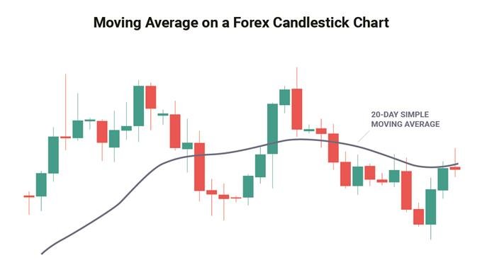
Moving Averages (MA)
Moving Averages are among the most commonly used indicators in forex trading. They smooth out price data to create a clearer picture of the market’s direction by filtering out the noise from random short-term price fluctuations. There are two main types of moving averages:
1. Simple Moving Average (SMA)
The SMA calculates the average closing price over a specific number of periods. For example, a 50-period SMA on a 1-hour chart would show the average closing price over the past 50 hours.
- How it helps: By providing a smoothed view of price action, SMAs help traders identify whether the market is in an uptrend, downtrend, or moving sideways.
2. Exponential Moving Average (EMA)
The EMA is similar to the SMA, but it gives more weight to recent price data, making it more responsive to new price movements. Traders often use the EMA to spot trend reversals sooner than with the SMA.
- How it helps: EMAs are useful for spotting short-term trends and changes in market momentum.
Using Moving Averages:
Moving averages can help you confirm trends and entry/exit points. For instance:
- Crossover strategy: This involves using two moving averages of different lengths (e.g., 50-period and 200-period). When the shorter EMA crosses above the longer one, it’s a bullish signal (buy). When the shorter EMA crosses below the longer one, it’s a bearish signal (sell).
Moving averages are especially useful in trending markets, where they help filter out the smaller price fluctuations that can distract from the bigger picture.
Relative Strength Index (RSI)
The Relative Strength Index (RSI) is a momentum indicator that measures the speed and change of price movements. It ranges from 0 to 100 and helps traders identify whether a currency pair is overbought or oversold.
- Overbought: If the RSI is above 70, it suggests the currency pair may be overbought, meaning the price could soon reverse downward.
- Oversold: If the RSI is below 30, it suggests the currency pair may be oversold, indicating that a price increase may be on the horizon.
How to use RSI:
- Traders often look for divergence between the RSI and price movement. For example, if the price is making higher highs, but the RSI is making lower highs, this could signal that the trend is losing strength and a reversal might occur.
- Confirmation tool: The RSI is particularly effective when used alongside candlestick patterns or support and resistance levels to confirm possible entry or exit points.
Bollinger Bands
Bollinger Bands are a volatility indicator that consists of three lines plotted on a price chart:
- The middle line is a moving average (usually a 20-period SMA).
- The upper band is the moving average plus a set number of standard deviations (usually 2).
- The lower band is the moving average minus the same number of standard deviations.
These bands expand and contract based on the market’s volatility:
- When the bands are wide: This indicates high volatility.
- When the bands are narrow: This suggests low volatility and a potentially impending breakout.

How to use Bollinger Bands:
- Price touching the upper band: This may indicate the market is overbought, suggesting a potential downward reversal.
- Price touching the lower band: This could indicate that the market is oversold, hinting at a potential upward reversal.
Bollinger Bands are also useful for spotting breakouts, as periods of low volatility (narrow bands) are often followed by sharp price movements.
Combining Technical Indicators
Using these technical indicators in isolation can be helpful, but they’re often most powerful when used together to confirm trading signals. For example, if the RSI shows that a currency pair is overbought, and the price is also touching the upper Bollinger Band, this strengthens the case for a possible downward reversal.
By integrating Moving Averages, RSI, and Bollinger Bands into your analysis, you can gain deeper insights into market conditions and improve the accuracy of your trading decisions. In the next chapter, we’ll look at support and resistance levels, which are key to understanding where price movements are likely to stall or reverse.
Support and Resistance Levels
Now that we’ve covered technical indicators, it’s time to explore one of the most important concepts in forex trading: support and resistance levels. These levels represent key price points where market behaviour tends to change, helping traders identify potential entry and exit points. In this chapter, we’ll explain what support and resistance are, how to identify them, and how they can help you make more informed trading decisions.
What are Support and Resistance?
Support is a price level where a currency pair tends to stop falling because there’s enough buying interest to prevent the price from dropping further. It acts like a “floor” for the price, often leading to a reversal or a pause in a downward trend.
Resistance is a price level where a currency pair tends to stop rising because there’s enough selling interest to prevent further price increases. It serves as a “ceiling,” often leading to a reversal or a stall in an upward trend.
Support and resistance are key in technical analysis because they help you understand where the price is likely to pause or reverse, which is valuable when setting targets for buying or selling.
How to Identify Support and Resistance Levels
There are several methods for identifying support and resistance levels on a forex chart:
1. Horizontal Support and Resistance Lines
- Historical price levels: Look for areas on the chart where the price has reversed multiple times. For example, if a currency pair has repeatedly dropped to 1.2000 and bounced back up, that level is acting as support.
- Round numbers: Large, round numbers (e.g., 1.0000, 1.5000) often act as psychological barriers, becoming support or resistance levels because many traders set buy or sell orders around these numbers.
2. Trendlines
A trendline is a diagonal line drawn across price points that shows the overall direction of the market. Trendlines can act as both support and resistance:
- Uptrend lines: In an uptrend, you can draw a line connecting the rising lows, which acts as support.
- Downtrend lines: In a downtrend, a line connecting the falling highs acts as resistance.
Trendlines are useful for spotting the direction of a trend and predicting where price corrections might occur.
3. Moving Averages as Dynamic Support and Resistance
As we discussed in the previous chapter, moving averages can act as dynamic support or resistance levels. For instance, a 200-period moving average might act as a support level in an uptrend or resistance in a downtrend. Prices often react to these moving averages, bouncing off or breaking through them.
4. Fibonacci Retracement Levels
Fibonacci retracement levels are horizontal lines based on the Fibonacci sequence, which highlight potential support and resistance levels. These are drawn by taking the high and low of a significant price movement and dividing the vertical distance by key Fibonacci ratios (e.g., 23.6%, 38.2%, 50%, 61.8%). Traders often use Fibonacci retracement levels to anticipate where the price might reverse.
Using Support and Resistance in Trading
Once you’ve identified key support and resistance levels, you can use them to guide your trading decisions:
1. Buying at Support and Selling at Resistance
One of the simplest strategies is to buy when the price reaches support and sell when the price reaches resistance. This is based on the assumption that the price is likely to reverse near these levels.
For example:
- If the price falls to a support level and starts to rise again, it might be a good time to buy, anticipating that the support will hold.
- If the price reaches a resistance level and starts to drop, you might sell, expecting the resistance to prevent further price increases.
2. Breakouts
Sometimes, the price will break through a support or resistance level, leading to a breakout. Breakouts can signal the start of a new trend, as the price moves decisively beyond previous limits.
- Break above resistance: If the price breaks through a resistance level, it may indicate the start of an upward trend. In this case, you might enter a buy position.
- Break below support: If the price breaks below a support level, it could signal the start of a downward trend, making it a good time to consider a sell position.
To avoid false breakouts (where the price briefly breaks a level but then reverses), many traders wait for a confirmation, such as a second candlestick closing beyond the support or resistance level.
3. Role Reversal
Once a support level is broken, it often turns into a resistance level, and vice versa. This is known as role reversal. For instance:
- If a support level is broken, the price may retest this level from below, but now it acts as resistance.
- If a resistance level is broken, the price might pull back to this level, which now acts as support.
Combining Support and Resistance with Other Indicators
Support and resistance levels are even more powerful when used alongside other technical tools, such as moving averages, RSI, and candlestick patterns. For example:
- If the price approaches a support level and the RSI shows oversold conditions, this strengthens the case for a potential bounce.
- If a bearish candlestick pattern forms near a resistance level, this may signal a strong reversal.
Bringing It All Together – Building a Forex Trading Strategy
Throughout this guide, we’ve explored various tools and techniques to help you read and interpret forex charts effectively. Now it’s time to put everything together and understand how these elements—candlestick patterns, technical indicators, and support and resistance—can be combined to create a well-rounded trading strategy. In this chapter, we’ll discuss how to develop a strategy that suits your trading style and helps you make informed decisions in the forex market.
The Importance of a Trading Strategy
A trading strategy is a set of rules and guidelines that help you decide when to enter and exit trades, how much to risk, and what tools to use. A solid strategy ensures that your trading decisions are consistent and not based on emotional impulses or random market events. It also helps you manage risk, which is essential for long-term success in the forex market.
Building a strategy means bringing together the knowledge you’ve gained about reading forex charts and using technical tools to make decisions that are logical and well-founded. Let’s look at how to incorporate the elements we’ve discussed so far into a cohesive plan.
Step 1: Defining Your Trading Goals and Style
Before creating a strategy, it’s essential to define your trading goals and the style that best suits you. Ask yourself:
- Are you a short-term trader (like a day trader or scalper) looking to make quick profits from small price movements?
- Or are you a long-term trader (like a position trader) focusing on larger trends over days, weeks, or months?
Your style will determine which charts, timeframes, and technical indicators you prioritise. For instance, a day trader might focus on 1-minute or 15-minute charts, while a swing trader might prefer 1-hour or daily charts.
Step 2: Identifying Market Conditions
One of the first things to consider when trading is the current market condition. The forex market is either trending or ranging:
- Trending market: When the price consistently moves in one direction, either upwards (bullish trend) or downwards (bearish trend).
- Ranging market: When the price moves sideways within a narrow band, bouncing between support and resistance levels.
Understanding whether the market is trending or ranging helps you decide which tools to use:
- In a trending market, moving averages and trendlines can help you follow the trend and avoid counter-trend trades.
- In a ranging market, support and resistance levels become crucial for identifying potential entry and exit points, as the price tends to bounce between these levels.
Step 3: Using Candlestick Patterns for Entry and Exit Signals
Candlestick patterns provide important signals about market sentiment and potential price reversals. When developing a strategy, it’s helpful to focus on a few key candlestick patterns you’re comfortable recognising, such as:
- Engulfing patterns: Signalling a potential reversal.
- Doji: Indicating indecision in the market.
- Hammer or Hanging Man: Suggesting potential market turns at support or resistance levels.
For example, if you see a bullish hammer pattern forming near a well-established support level, it may indicate that buyers are coming back into the market and the price could soon rise. This could be a potential buy signal.
Step 4: Using Technical Indicators to Confirm Your Trades
While candlestick patterns provide entry signals, it’s crucial to confirm these signals using technical indicators to increase the probability of success. Here’s how to use the indicators we’ve discussed:
- Moving Averages (MA): Use moving averages to identify the trend and ensure that you’re trading in the same direction as the overall market. For example, in a bullish market, you might look for a short-term moving average (like the 50-period EMA) to cross above a longer-term moving average (like the 200-period EMA) before entering a buy trade.
- Relative Strength Index (RSI): Use RSI to identify whether a currency pair is overbought or oversold. If the RSI is above 70, it might suggest a reversal to the downside (a good time to sell). If it’s below 30, the market could be oversold, signalling a potential buying opportunity.
- Bollinger Bands: Look for breakouts or price movements near the upper or lower bands. If the price touches the upper Bollinger Band and the RSI indicates an overbought condition, it could be a signal to sell.
Combining these indicators can help you filter out weaker signals and focus on trades with higher potential.
Step 5: Managing Risk
No strategy is complete without a solid risk management plan. Managing your risk ensures that you can stay in the game even if some trades go against you. Here are a few ways to manage risk effectively:
- Set stop-loss orders: Always use stop-loss orders to limit potential losses. For example, if you enter a buy trade based on support and candlestick confirmation, place a stop-loss just below the support level in case the market moves against you.
- Position sizing: Risk only a small percentage of your trading account on any single trade. Many traders risk 1-2% of their capital per trade, ensuring that a few bad trades won’t wipe out their account.
- Take profit targets: Set take profit targets based on resistance levels, trendlines, or key Fibonacci levels. This helps you lock in gains and avoid holding a position too long.
Step 6: Backtesting and Adjusting Your Strategy
Once you’ve built your strategy, it’s important to backtest it using historical data. This allows you to see how your approach would have performed in the past and gives you a better understanding of its strengths and weaknesses.
You can backtest your strategy by:
- Reviewing past price movements on forex charts.
- Identifying when your strategy would have signalled an entry or exit.
- Measuring how well it performed in various market conditions.
After backtesting, you may need to tweak your strategy. Markets change over time, so be flexible and ready to make adjustments as needed.
By combining your knowledge of forex charts, candlestick patterns, technical indicators, and support and resistance levels, you can develop a trading strategy tailored to your style and goals. This strategy will provide structure to your trading decisions, helping you stay disciplined and make informed choices. Remember, no strategy guarantees success, but with practice, risk management, and constant learning, you can increase your chances of becoming a successful forex trader.
Good luck, Elephants! Stay patient, stay informed, and keep moving forward on your trading journey.